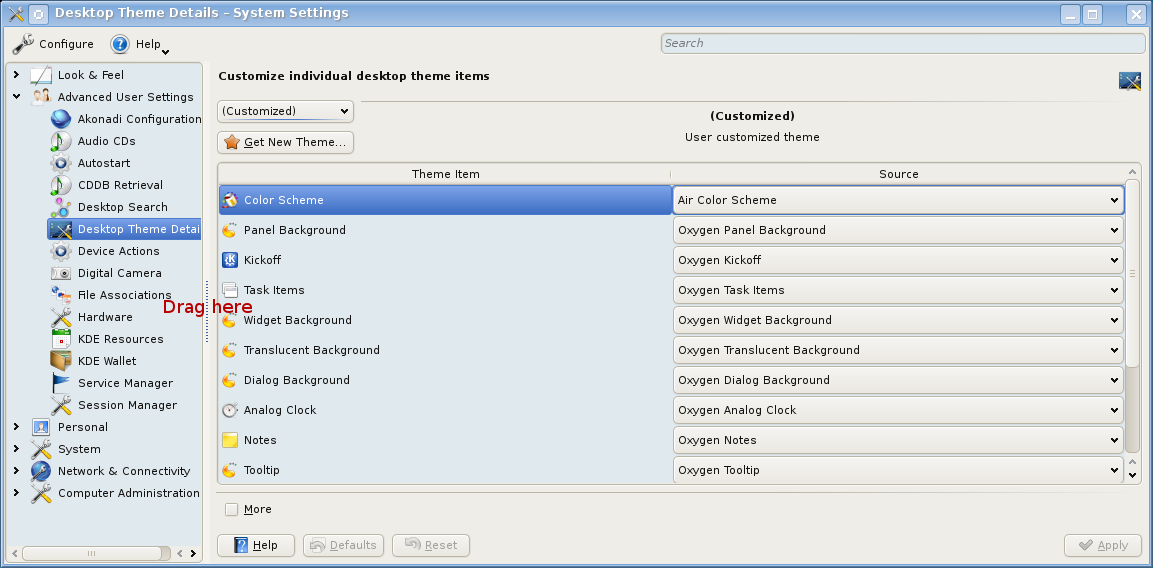
Dotan Cohen schrieb:
>> Usability:
>> * In KDE3 you could change the time format of the clock applet by right
>>  clicking on it and selecting "date & time format", that means with 2 clicks only.
>>  In KDE4 this menu item has been removed. IMO that's counterintuitive. Many people
>>  would expect this functionality there, I think. Currently the only way to change
>>  the date & time format is to start system-settings and go to
>>  "Personal"->"Region & Language"->"Country/Region & Language". I doubt that all
>>  KDE4 users will find this settings dialog immediately.
>>
>
> Comment and vote here:
> https://bugs.kde.org/show_bug.cgi?id=162368

Thanks for finding this bug report. My issues have been already mentioned in comment #3
and James Richard Tyrer is working on it. So I'm curious about the new version of the
clock plasmoid.

>
>
>> Waste of Space:
>> * For today let's just compare the kicker and the Plasma panel. Here are some
>>  screenshots:
>>  - http://stefan.endrullis.de/kde/waste_of_space/kde3_kicker.png
>>  - http://stefan.endrullis.de/kde/waste_of_space/kde4_kicker.png
>>  To be fair I gave both panels nearly the same size (it's hard to set an exact
>>  panel size in KDE4 because the numeric input for the size has been removed in
>>  KDE4, but that doesn't matter for me).
>>  When I compare both pictures I see that...
>>    - the KDE4 pager has much smaller previews (~65% of the size of the KDE3
>>      pager)
>>    - the KDE4 task manager is less readable than the KDE3 version, because of
>>      the smaller font
>>    - the KDE4 system tray consists only of one row which leads to an increased
>>      horizontal width
>>    - the KDE4 icons for the battery and network connection are 4 times larger
>>      than in KDE3. But this is already a known issue that has been reported
>>      here:
>>      - https://bugs.kde.org/show_bug.cgi?id=182193
>>      - https://bugs.kde.org/show_bug.cgi?id=167132
>>
>
> Please, please make a comment on this bug:
> https://bugs.kde.org/show_bug.cgi?id=204917

Good question if this is solvable by a new theme. If yes, then KDE4 would be great!
But so far I could not test any desktop themes at all, because system-settings does
not apply the themes I select. But there are already several bugs related to this
problem:
- https://bugs.kde.org/show_bug.cgi?id=198572
- https://bugs.kde.org/show_bug.cgi?id=205330
- https://bugs.kde.org/show_bug.cgi?id=182823

>
> Your input and research is very much needed there. Thanks!
>
>>      And regarding vertical panels you have to multiply this issue by 3, as
>>      you can see in the nice screenshots in the second bug report)
>>      And sorry, but whenever I see this over dimensioned KDE4 battery plasmoid
>>      I have to laugh. It's so big but it's only able to show _5 different states_!
>>      That leads actually to this problem that you cannot distinguish between 38%
>>      and 62%, because both states are represented by 2 bars. Well, I would be
>>      interested in this difference, especially when the battery runs low.
>>      I will never understand why some developers love to hide useful information.
>>
>>      But to see the differences to KDE3, let's compare the KDE4 battery plasmoid
>>      with KLaptop. KLaptop uses only 1/4 of the icon size, but is able to represent
>>      _81 different battery states_ (in 5x16 pixels)! The trick is to use not only
>>      a vertical progress bar but another the horizontal progress bar in each pixel
>>      row. When I saw this for the first time (some years ago) I was fascinated by
>>      this brilliant idea and thought: Yeah, that's one of the reasons I'm using
>>      KDE!
>>

I've filed a bug addressing the super-size battery plasmoid without useful information:
https://bugs.kde.org/show_bug.cgi?id=205707

You're welcome to post comments or vote for it.

>
> You have already posted a link to bug #167132 but for those who are
> following along, that is the bug for reporting the too-large widgets.
>
>
>> system-settings:
>> I'm happy about the tree view in system-settings, but I'm still missing
>> several intuitive features from kcontrol:
>> * tree navigation via keyboard:
>>  - image you have selected a node in the tree and now you
>>    * press ENTER: the content of the node should be loaded
>>    * press LEFT: the parent node should be selected when the current node
>>      is not expanded
>
> Can you check that against other tree views in KDE and either confirm
> that this is inconsistent with the rest of KDE, or that all of KDE
> needs to be improved here. Thanks!

Hm, I couldn't find another KDE application with a tree so fast. Sorry.

>
>
>> * incremental search:
>>  - was a bit better in kcontrol. For instance, enter "date" in the search
>>    field. In kcontrol you immediately see the results and you need only one
>>    mouse click to get there. In system-settings the incremental search leads
>>    only to new node colors (grey for unimportant nodes, black for matches).
>>    You still have to expand the interesting nodes by hand. I suggest to do
>>    that automatically when changing the search value. In the end, this
>>    colored tree (if expanded) is even better that the plain list in kcontrol
>>    because you can easy categorize the hits.
>
>
> How's this:
> http://bugs.kde.org/show_bug.cgi?id=205342

Yes, that's great. Thanks!

>
>
>> * moving the slider between the tree and the current settings does not work.
>>  But in some cases it would be necessary.
>>
>
> I do not understand, could you be more specific? Thanks.

Ah, sorry. I meant the splitter between the tree and the current settings, marked
in this screenshot with "Drag here":
http://stefan.endrullis.de/kde/system-settings-drag.png

This screenshot shall illustrate why dragging this splitter might be useful:
http://stefan.endrullis.de/kde/system-settings-bug.png

As long as it is not needed I don't want to have a horizontal scrollbar in the
tree. That's why I would try to use the splitter to resize the tree.

>
>
>> The issues regarding the plasma panel might and the KDE4 performance (not
>> mentioned here) might currently be the most important issues.
>>
>> But also apparently minor issues like the navigation in trees are important
>> for. Fast keyword work was always one of the key features of KDE3, I think.
>> Sadly in KDE4 the possibility of keyboard navigation was completely ignored.
>> Just try to save a screenhot in ksnapshot by using only the keyboard. You
>> can navigate to a directory and press ENTER. Instead of changing into this
>> directory, ksnapshot thinks you want to enter the dir AND save the file
>> afterwards. Strange implementation! I would never expect both actions at the
>> same time.
>
> Please write a "this is what I did, this is what I expected, this is
> what happened" format, I'll verify and file it. but make sure that you
> are on KDE 4.3 first, as it is a bit different than KDE 4.2. Thanks!

Open ksnapshot and create a screenshot. Press "Save As", click on "Home", and
click on the background of the directory list. Now you can do a quick keyboard
navigation. Enter the directory name in which you want to change. Then press
ENTER. Normally one would expect that you only change into this directory when
pressing ENTER. But the open dialog does not only change into the directory,
but saves also the file in this dir afterwards. This is unintuitive. If the
cursor / focus is in the directory list ENTER should only be used for the
navigation in the directory tree. Only when I changed to the filename input
field (by pressing TAB) and press ENTER I would expect the file to get saved.

>
>
>> But this issue concerns not only ksnapshot, but it's a general problem of
>> the same dialog and therefore concerns all KDE4 apps.
>>
>
>> BTW, I would be also very interested in a super-tiny style for KDE4.
>>
>
> Then comment on bug #204917, the more people who support it the better.
>
> Thank you very much for your analysis! It is exactly the little
> details like these that pile up and make KDE 3 so great, and at the
> same time pile down and make KDE 4 frustrating to use.
>

Thanks, too!

Regards,
Stefan